CASE STUDY: Hourglass Media's Storied History Graphic
⌛ By Kaylin R. Staten ⌛
We’re on our second installment of our case studies series. This is a series that has been a long time coming, as I really have wanted to share our work and behind-the-scenes magic for award-winning Public Relations Society of America award entries and case studies.
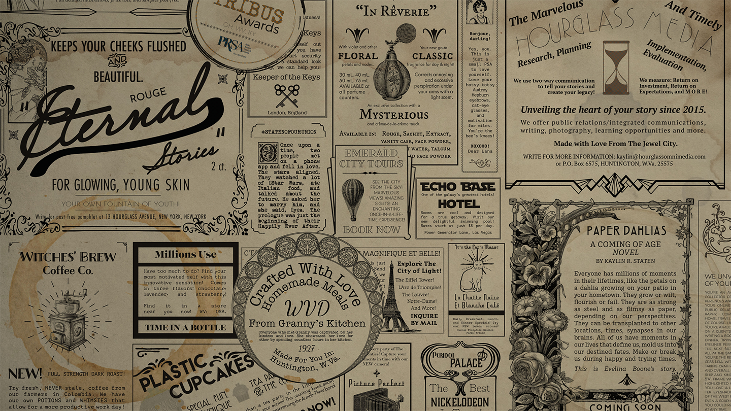
This one centers on Hourglass Media’s Storied Legacy Graphic, created in 2019 after my trip to New York City. This graphic earned a Tribus Award for a Billboard and Other Signage Tactic in 2019 for this graphic and its implementation in Hourglass Media’s overall use of the graphic.
Learn more about the 2019 Tribus Awards and see the master list of winners here.
Like we stated in our Electronic Press Kit case study, for each campaign and tactic, we use the RPIE process of public relations, which is: Research, Planning, Implementation, and Evaluation. I’m sure you’ve seen me use that formula before, as it is a cornerstone of what Hourglass Media does internally and externally in its continued public relations efforts. You may also know it as RACE or ROPE, depending on your school of thought, but we use the APR-standard of RPIE.)
So, let’s get started! First, here is a photo of the graphic, and I’m sure you have seen it before, as it’s in A LOT of our collateral materials and general branding.
RESEARCH
Hourglass Media had a glow-up of sorts in 2019, and much of it can be attributed to more clarity about our business goals and objectives, as well as a revamped brand. 2019 was the four-year-in-business mark, and we thought it would be the perfect time to add to our ever-growing brand. The thing is, however, you have to find that creative spark of inspiration to bolster a rebrand. That doesn’t always happen instantly when you’re a solopreneur with a growing company! As a creative, though, I love finding myself in the midst of a creative, inspirational streak, and I used that to my advantage during my trip to New York City in March 2019. As the CEO and founder of Hourglass Media, I use the company’s mission and my own personality to lead the company with authenticity, grace, and resilience. I saw wallpaper in a coffee shop in NYC that led me down the vintage-advertisement graphic route, which was my main form of primary research. Other research included conversations with others, an internal SWOT Analysis, updating the business plan to reflect this new branding focus, market research, and more.
PLANNING
This honestly was the best part! Before the creation of this evergreen graphic, Hourglass Media had a hybrid aesthetic of vintage and modern, bleeding remnants of the past with the present and future. From the beginning, Art Deco has influenced the company’s look and feel, and the 1920s to 1940s serve as a period of inspiration. The goal was to tell Hourglass Media’s story in one glance, complete with Easter eggs and our vision for years to come.
Objectives were the following:
Add a variation of the master graphic on all owned and rented platforms by June 2019
Completely re-brand by the end of 2019
The process was long one, but it was well worth the multiple mockups and digital drafts using Adobe Creative Cloud. My intention was to use my sentimentality and Hourglass Media’s mission to make the brand come to life on paper and screens. I used paper bag and coffee and water stained layers for the background and then placed each graphic on top of that layer. Each advertisement tells a story, from showcasing my love of “The Wizard of Oz” and the classic “Star Wars” trilogy to highlighting works, such as From Granny’s Kitchen and Plastic Cupcakes. Each ad is a perfectly imperfect reel of our narratives.
IMPLEMENTATION
Rebranding takes time, and once the graphic was completed and optimized for several formats, we began putting it everywhere. This included owned platforms, such as our website, IGTV video introductions, and blog post graphics. We also placed the image on rented platforms, like Facebook, Twitter, Instagram, LinkedIn, YouTube, Pinterest, and more. We continue to still update our items with this graphic and overall look. This graphic spawned a collection of like-minded graphics, from new blog post cover photos to additional fonts and colors.
EVALUATION
This graphic has already been seen more than 100,000 times since its arrival onto our owned and rented platform scenes. It’s become a staple of Hourglass Media and serves as a conversation piece with our target audiences. We did completely rebrand by the end of 2019, meeting both of our objectives and master goal. We’ll continue to springboard from this inspirational graphic to create even more content that resonates with our target audiences for years to come.
Kaylin R. Staten, APR, is an award-winning, accredited public relations practitioner and writer based in Huntington, WV with 18 years of professional communications experience. As CEO and founder of Hourglass Media, she uses her compassionate spirit and expertise to delve into the heart of clients’ stories. She is a recovering perfectionist, mental health advocate, wife, Luke’s mom, cat mom, and Leia Organa aficionado. Connect with Kaylin on LinkedIn.


